Give me some space, man!
A rant about why less is more when it comes to brand marketing
As Beth Gibbons purred in Portishead's 1994 classic, Glory Box, "Move over and give us some room, yeah!" She wasn't referring to making space in brand marketing strategy and execution, but then again...
We've all been there. Gleefully uncovering brand and product selling points that might just be 'unique', and wanting the world to know about them. All of them. And to make matters worse, listing off all the sparkling features and benefits of the product or service is catnip to the CEO / Sales Director / client. They say "nobody ever got fired for buying IBM", and maybe your jam-packed strategy or advert won't lead to a P45 either. But stop. Step away from the bullet point. Breathe.
You might think it's a generational thing. That today's under 25s are wired differently to expect and appreciate everything everywhere all at once. But, as with most generational generalisations, that's just not true. A recent study of UK 15-22s by Censuswide Research and true student found that this age-group's favourite aesthetic is "minimalism" and "calm". They're actively seeking space - in their decor preferences, in their holiday choices (a 2023 Morning Consult survey found the top reasons for Gen Z to go on holiday are "Escaping" and "Relaxing") and in their heads ("overstimulation is leaving Gen Z with less time to connect" - Psychology Today), possibly due to the choice bombardment of social media.

Generation-aside, people just don't remember many messages, especially in communications and strategies that are over-stuffed and neither entertaining nor inspiring. Corporate Visions research shows that the average person only remembers 10% of marketing messages they consumer after 48 hours. And that's the stuff they actually CONSUME. The rest is just waffle and, worse than that, it's headache inducing, space-grabbing waffle. Without diving into a tirade against lazy digital advertising's role in the descent of public opinion towards marketing and advertising, and its effectiveness, I'll just say that it's our job as branding and marketing professionals to cut the crap and embrace the focus.
Breathe.
White space, or 'negative space', in an ad or in a strategy, is a thing of beauty. It means we've found our focus. We've simplified. It’s emphasis. It’s knowing what you are and what you want to say so clearly that it’s also just as obvious what you don’t want, or need, to say. It’s like pauses in a speech, eye-contact that lasts that extra second, a loooong breath in before a reaction, a day away from your partner. And, more importantly, it draws the eye to 'consume' and to remember.
Stella Artois have managed a combination of both creative and strategic white space in many of their campaigns through the years. Consider the simplicity of the classic ‘Reassuringly Expensive’ TV ad (https://www.youtube.com/watch?v=DJGErxEqBZU) and the clarity of focus on heritage and premium product in this print ad
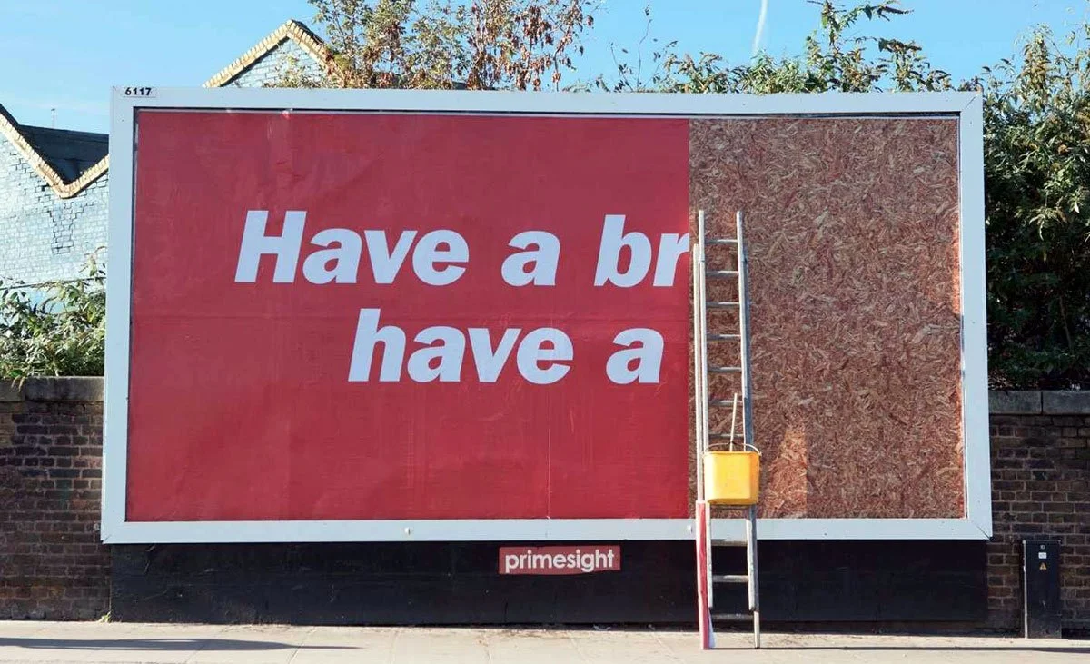
Kit-Kat’s strategic and creative white space is so strong, they no longer need to finish their sentences or show their logo to drive recognition
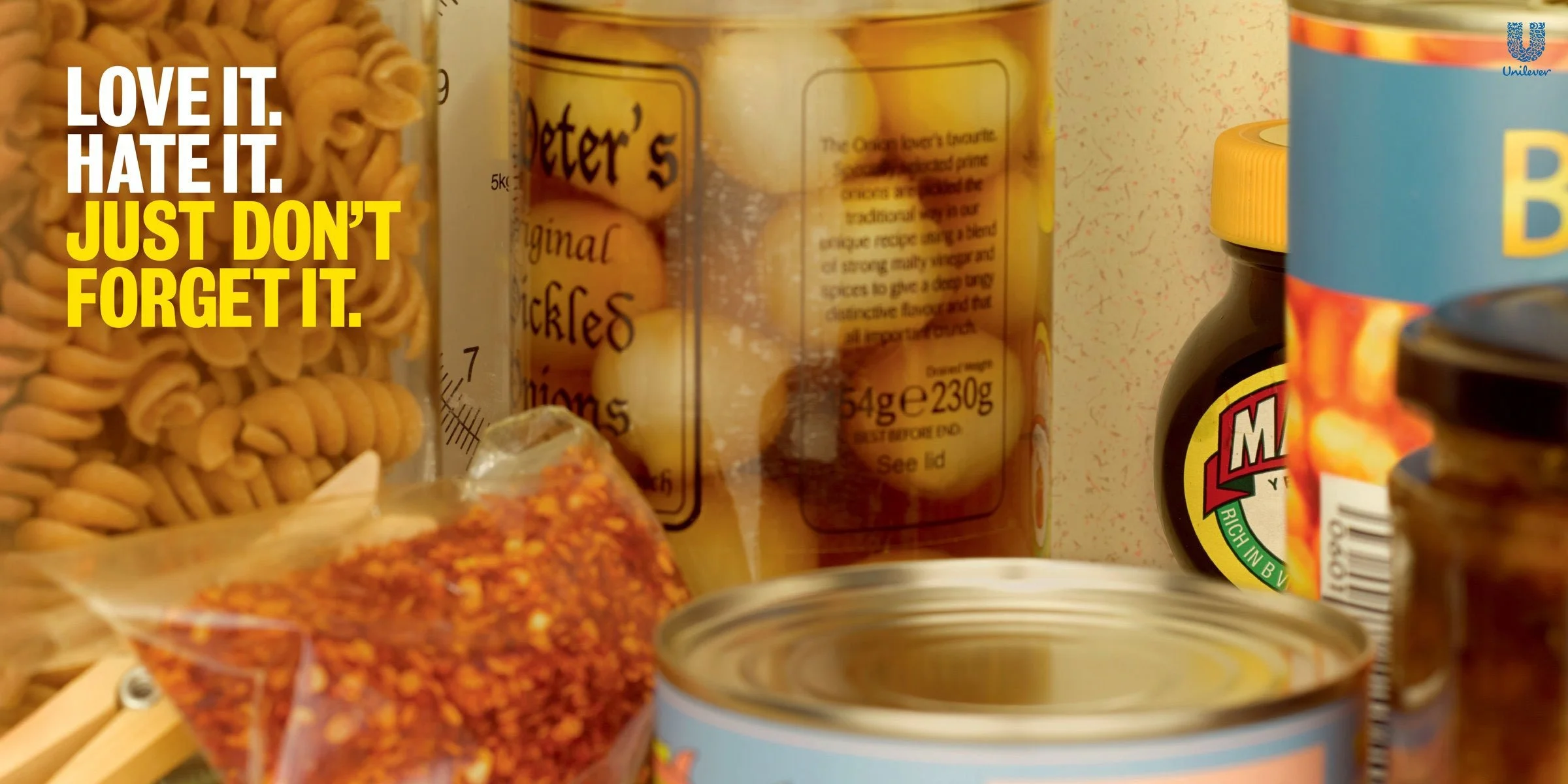
And Marmite’s Love it or Hate it strategy has been giving them strategic and creative classics for years.
Don’t get me wrong – I'm not saying ALL marketing should prioritise spaciousness and minimise message / copy / details. When people are looking for details, give them what they want; the ingredients, the materials, the parts, the clauses…all transparently available. Just not on a billboard, or a Cinema ad, or in a tagline, or on a damn digital banner!
Breathe. Let your simple, focused message seep in. Let your consistent designs and colours and taglines and imagery build memory over time. It'll be best for us all in the long run - especially Beth Gibbons.